Hello! Welcome to my little big world. I am a writer and visual artist wonderfully inspired by everything going on around me, including the insanity, which is just the greatest gift for someone like me – an artist. I used to be surprised by how wonderful, beautiful and nutty people can be – in a good way, but some of the outright evil-spiritedness of people who pretend that what they do and say is “normal” is simply jaw-dropping. Irony abounds, especially as a result of blind ideology, so I thank all those who contributed to my ability to be above it all, free of the nonsense, and able look down at it all like a satellite. The material I’ve got is never-ending. And all I have to do is look. The material is… everywhere.
Take a close look at the picture below. What is going on? Where do you think this story might be going? I’m having a hard time completing this book because it’s so involved. You might think it’s just a picture book for children, but it’s not. When this book is finished it will have more depth and meaning than all the contemporary art in our National Gallery. I can’t wait to focus on it again. Along with being difficult it is so much fun.
As a result of my picture books having different themes and moods, the artistic style of each book changes. And for my paintings (non-illustrative work), I flit around from portraits, to landscapes, to surreal stuff, to figurative works and on to big themed classical style paintings. Unlike most other artists, I’m not committed to a particular style of art. (I avoid ideology.) Much more interesting than aesthetics, and far more challenging, is working with themes sprouting from human nature. And to make these themes accessible to the viewer, and something worthy of rumination, I employ a combination of the four perennial social functions of art. I expand on this a bit, below.

One result is that you’re unlikely to see my work in a typical private gallery. Here in Thunder Bay, we no longer have any private galleries. I do have shows in public galleries of which we have two. I’m quite happy showing my work in coffee shops, restaurants, lobbies, etc. And I do have the occasional show I put on myself. I had a little gallery/studio with a storefront for three years before I shut it down due to Covid. It was great having the extra space to work in and the opportunity to interact with the public.
In much of my work I attempt to mix the best properties of High and Low Art (Popular Art). This makes me a Perennialist of the art-world. I employ the four primary historical functions of art (and all their many sub-functions) that are perennial to human nature. These four functions have been employed by our ancestors for thousands of years in all cultures the world over, which continue to operate today, primarily in popular and tribal cultures. Each of the four functions have many sub-functions. Knowing what these functions are and how they operate gives me confidence in my choices of approach, and dramatically expands the richness of a good idea when I get one. Knowing what the functions are, combined with an understanding of human nature, directs me to endless sources of subject matter.

My favourite mediums, in order, are watercolour, graphite, oil, acrylics, and now – more rarely: photography. Watercolour is so much fun because its results are sometimes unpredictable and can lead to amazing accidents. For figure drawing sessions, using watercolour can end in disaster very quickly, but when it works– Wow! It’s almost as if a heavenly muse is tapping my head. And sometimes watercolour likes to do its own magical thing. It’s all about knowing the tools, the paper – being familiar with everything involved. Watercolour teaches you how to paint. Painting in oil isn’t always easy, but it is by comparison to watercolours. (This is all personal preference, of course.) Both watercolour and oils allow for glazing, which… again… Wow! – when it works, you feel like a master artist.

Working in graphite (“pencil” doesn’t sound fancy enough) is very direct. Nothing bleeds, strays, or mixes unless you want it to. Graphite is a great way to have total control. And it’s the best way to plan a larger works.

Oils have can have more intensity or murkiness, boldness, texture, contrast, etc. Oils are incredibly versatile, but require a lot of practice to get right. And if you treat oil like watercolour – thinning and letting the oils bleed, you can get some of the same watercolour effects. But oil is stinky, messy (gets freakin’ everywhere) and is heavy (elderly artists find it troubling), and often problematic for your health if you don’t have a big studio and can’t open the windows in winter. I don’t have a big studio, so being a neat freak with oils becomes important.

In the above landscape, Beaver Mountain, the paint gets thicker from top to bottom. Below is an oil painting for the children’s picture book, Lara Wood. Lots of glazing and dry-brush was involved. If you look closely you can see Lara being followed by a wolf.

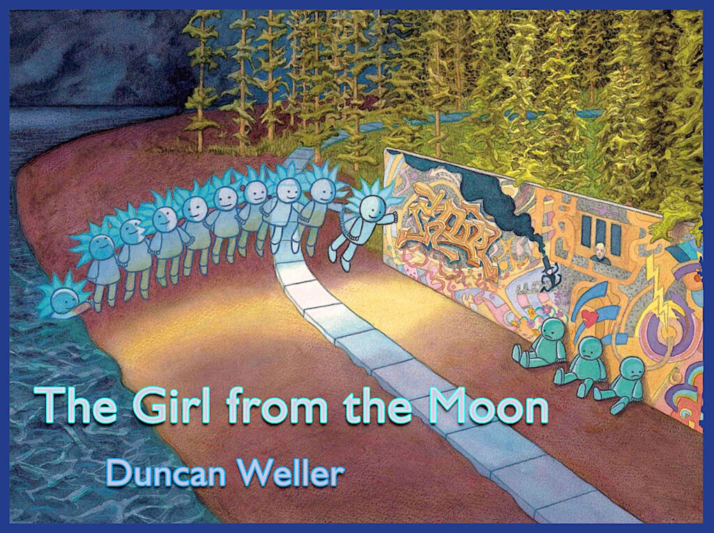
A number of study drawings were required for Lara Wood, but I didn’t plan it out beforehand as much as I should have. I tried to invent quite a few things while painting without reference, and it cost me a lot of time. Because illustrations like this require narrative detail, involving allegory and symbolism, the better planned out the illustrations are ahead of time, the better the results. One day I’ll complete the picture book, but in the meantime I’ve developed the story into a fantasy drama for adults (or young adults), which I’ve started to write as a script for film, instead of writing a novel. It’s a little easier to do.  Illustration for an upcoming children’s picture book, The Girl from the Moon. Watercolour and ink.
![]()
The above illustration is for The Girl from the Moon. It’s primarily watercolour with a bit of ink work for the path and the little characters. The book will be a companion piece to The Boy from the Sun (winner of a couple national awards back in 2007). I love the concept for TGftM, but it’s so grand I may have to settle for a minimized version just to get it printed before I die.
This scene of a Beacon Hill beach-front, splattered with logs and sticks, is pure watercolour. It was a delight to paint and got so many positive reactions that I could have sold it a hundred times over. Instead I gave it to friends I made in Holland who let me stay with them when a volcano went off in Iceland and nearly all flights across the Atlantic were cancelled.
Portraits! Again, I haven’t chosen one style in which to do things. I love the approaches and techniques of Rembrandt, Wyeth, Freud, Nerdrum, Varley and too many more to list, including a roster of black American and Canadian portrait artists who have broken into the art scene in the last twenty years.

I used to work primarily from photographs to do my portraits, but in the last few years I’m drawing and painting from life. With my figure drawings, my favourites are always those drawn from life. The focus and immediacy required to capture, not only the likeness, but the spirit of the person in a live drawing comes with a lot of practice, and likely talent. Yes, some things you have to be born with. With all my hundreds of figure drawings I can tell immediately which ones were done from life and which ones from a photo. And I remember the “feeling.” This is hard to explain, but when I was young, whenever I had this “feeling” (like sitting in Heaven) I knew when a drawing would be great – before I drew it. It’s as if my brain was “wired” for this stuff. That “feeling” isn’t there any more, but I know when and where it should be. Once, and very rarely, in a blue moon, it’ll come back to me and it’ll thrill me, but because I want it so badly to come back, it quickly goes away. It’s as if the “talent” is being shy to reveal itself – as if there’s another person inside me who is happy to observe what I’m doing, but no longer needs to encourage me or participate.
The third portrait painting above, from the left is Samantha, which was started with a live drawing and then with additions at a later session. If I may be so bold, it’s almost at a “masterpiece” level. I think if I get Samantha to sit again and I glaze the painting for subtleties it could be worthy of a national gallery. We’ll see. (By the way, outside of Thunder Bay, no one collects my works – I’m a complete unknown.

Part of a series I’ve started, semi-portraiture with a thematic edge, are the fourth and sixth paintings from the right. I’m featuring children as the focal points within a background that the children have painted themselves.

Lara Wood makes her way through a dying forest. A wizard has put a curse on the land and Lara is seeking him out to have words with him. Here, a wolf is trailing her and Lara suspects the wolf has its own mission.
The illustration below is from the GG and Schwartz Award winning book, The Boy from the Sun. (Margaret Atwood was on the jury for the Governor General’s Award that year!) The essential meaning behind the book is, ultimately: choose your own path. However! It’s not that simple. There’s a lot more to this “simple” or “basic” book for children. Allegory is fantastic when it works, and I think it works here. Some people find this book pale in its meaning with a sappy poem, but others have tried to climb into it. (Seriously, I’ve heard from parents that their 1.5 year old kids have opened the book, laid it out on the floor and tried to climb into the pages.) And children who’ve grown up with my book have told me it’s their favourite children’s book. So, that’s nice.
